In this article let's go through the Carrier Performance dashboard together and have a better understanding of what insights you can get out of it.
To open the dashboard, follow the steps below.
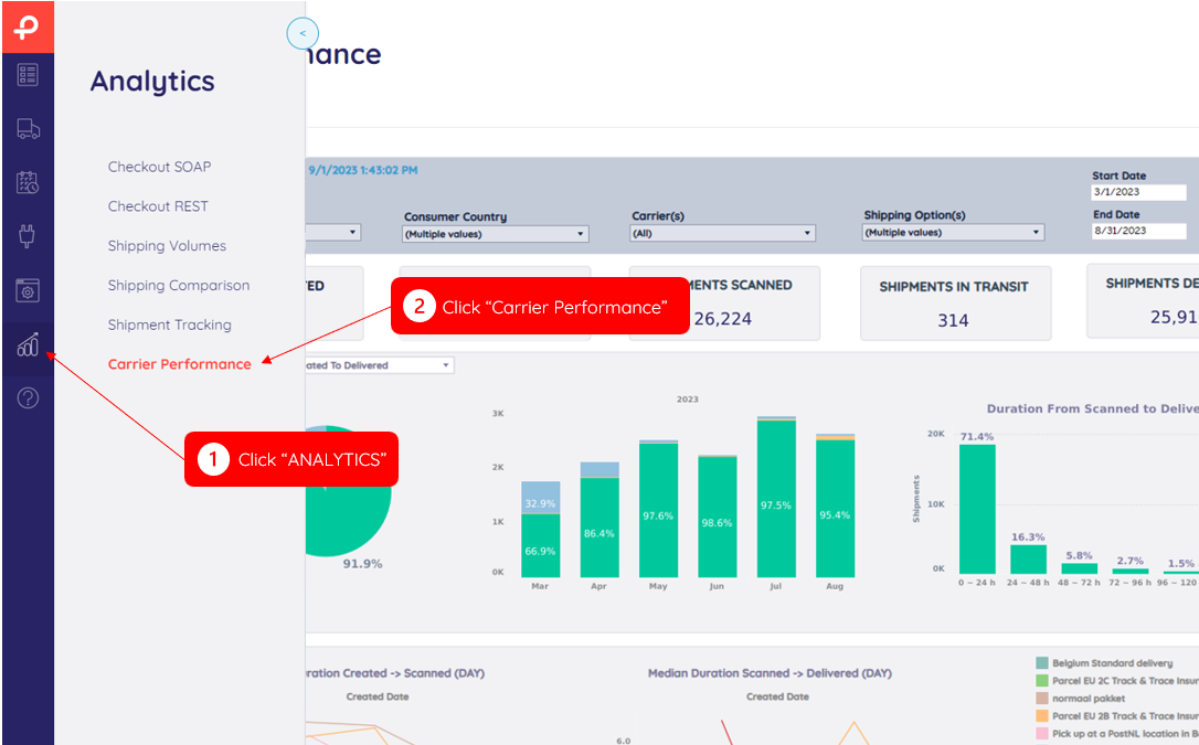
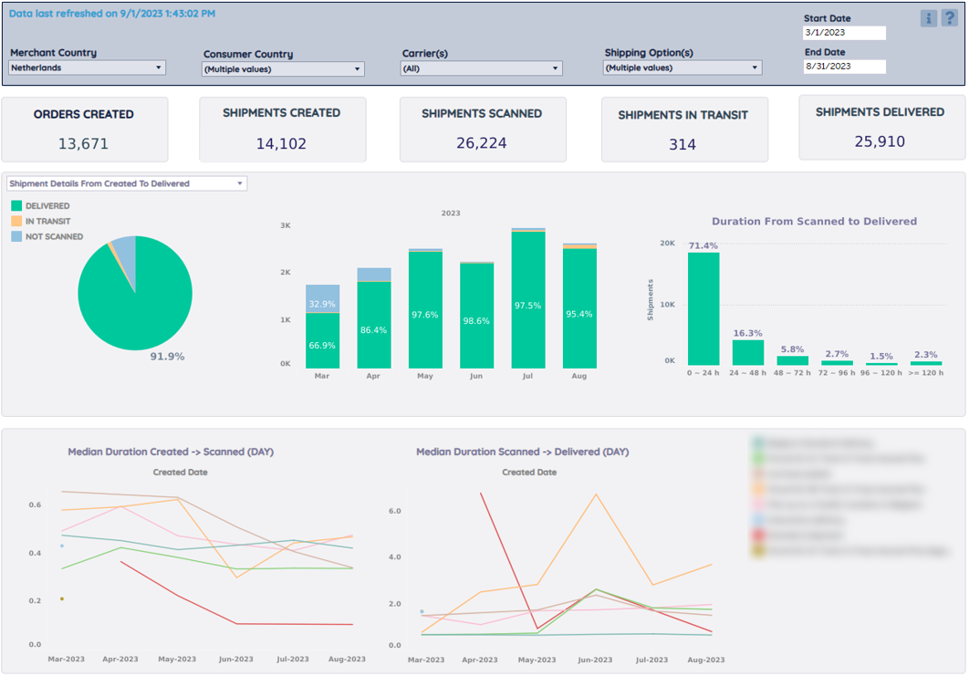
This dashboard offers insights into the different stages and durations from shipment creation to delivery, over the last six (full) months.
Note
This dashboard is only about outbound shipments.
Main Menu
Select the variables you want to include (or exclude) in the charts and tables.
Key numbers
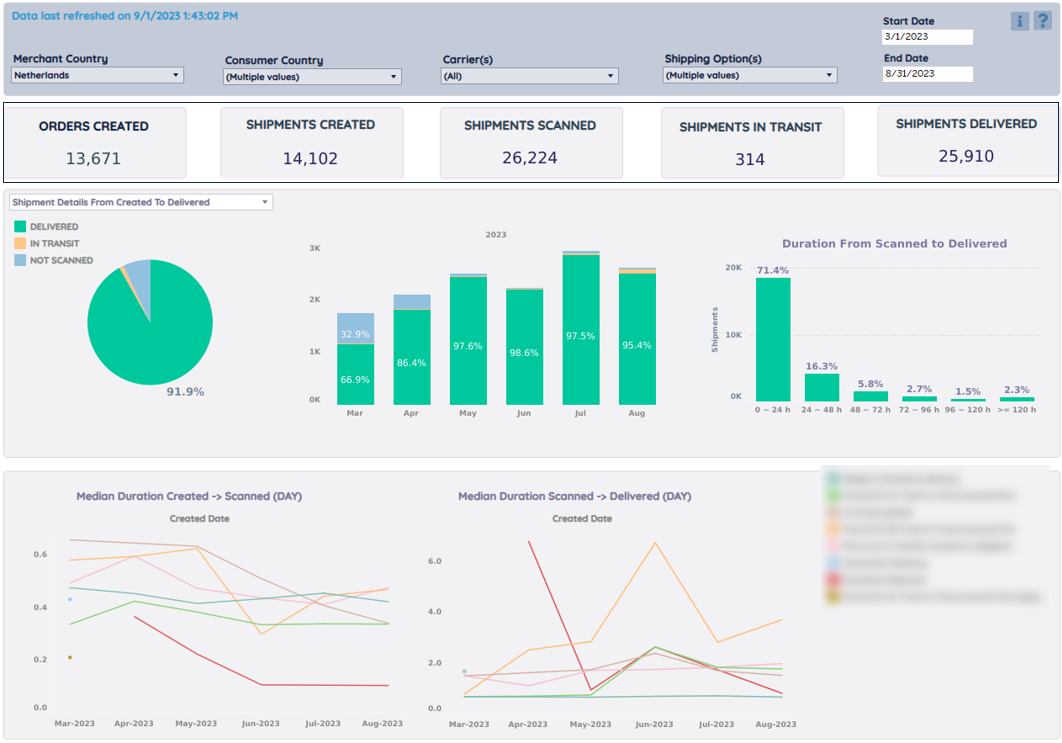
Here you can find the total numbers (over the last six months) of:
- ORDERS CREATED: # orders stored/created in your Paazl (sub)account(s)
- SHIPMENTS CREATED: # of labels that were printed. 1 order can have multiple labels
- SHIPMENTS SCANNED: # of shipments scanned by the carrier(s)
- SHIPMENTS IN TRANSIT: # of shipments on their way for delivery
- SHIPMENTS DELIVERED: # of shipments delivered (e.g. @home, @neighbours, @pickup point)
Charts – Shipment details from created to delivered
In these three charts, you find an overview of the shipments created in a certain period of time and what stages (NOT SCANNED, IN TRANSIT, DELIVERED, or DELETED) they were at since the last refresh, and for delivered shipments, the duration time from the first carrier scan to delivery.
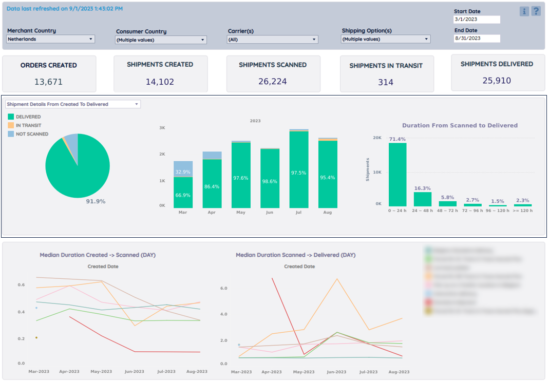
Pie Chart - % of shipments delivered
Based on the total # of shipments created. Other categories are 'not scanned', 'in transit', and 'deleted'.

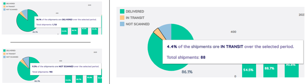
The pie chart above shows you all shipments created in the selected period of time. For example, there are 86.1% of the shipments delivered, 4.4% still in transit and 9.5% not scanned yet.
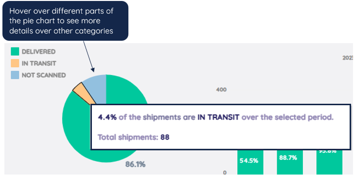
Hover over the pie to see the percentage and total shipments of other categories.
Bar Chart - Shipments Status per month
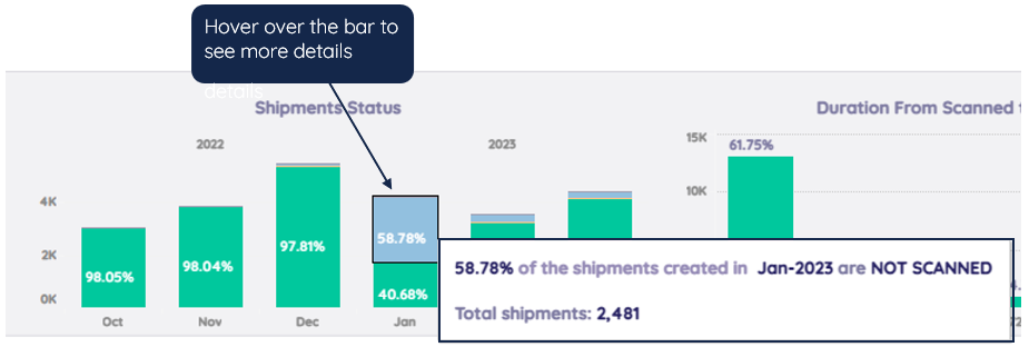
This chart breaks down the number of delivered, in transit, not scanned, and deleted shipments per month, over the selected period of time.
Moreover, this is also the place to see the % of shipments created in previous months that are still in transit or not scanned yet based on the last refresh.

Hover over the bar to see the percentage and total shipments.
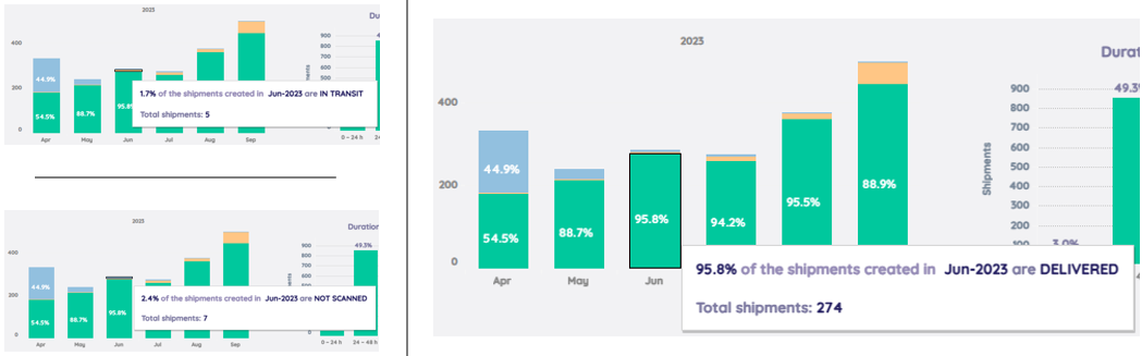
The bar chart above shows you all shipments created in a given month. For example, there are 95.8% of the shipments delivered, 1.7% still in transit and 2.4% not even scanned yet.
To deep dive into the undelivered shipments created in the previous months, you can download the Table-Undelivered Shipment Details for further analysis which contains barcodes, order reference, carrier, etc. details.
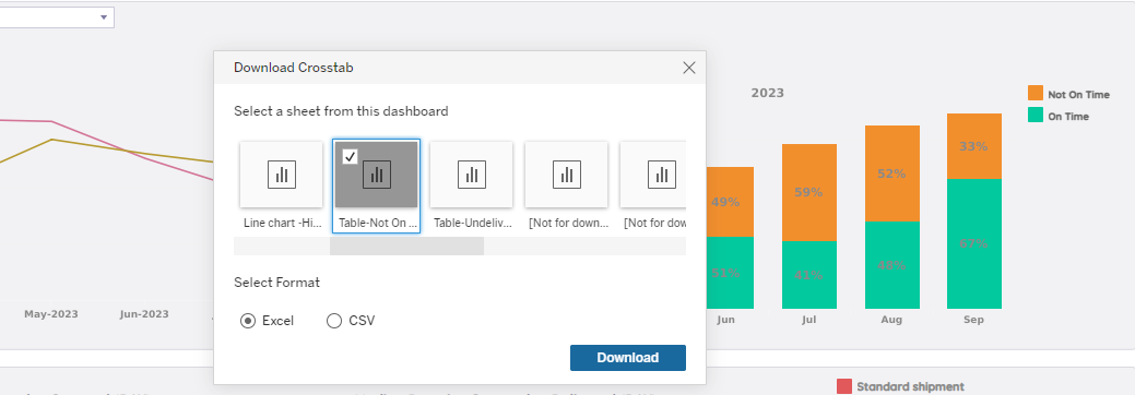
Or simply click on a certain part of the bar to download only those shipments' details.
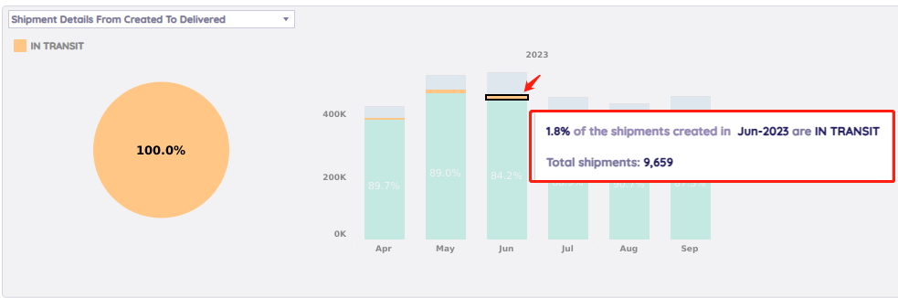
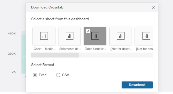
As an example above, click on the yellow part of the June Bar to download the shipments created in June while still in transit since last refresh.
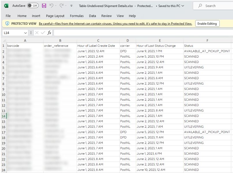
Above is an example of a downloaded Excel file.
Bar Chart - Duration From scanned to delivered
This bar chart on the right side presents the distribution of duration (hours) between shipments scanned and delivered. Here you can get a quick overview of how long it usually takes for a carrier to deliver a package.

Click on the sorting button to change the sequence.
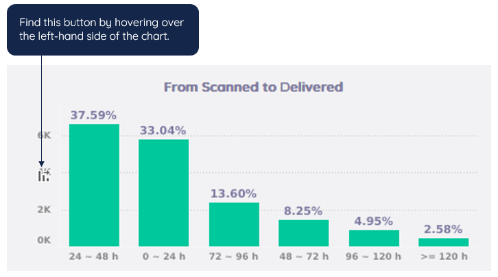
Hover over the bar to see the percentage and total shipments.
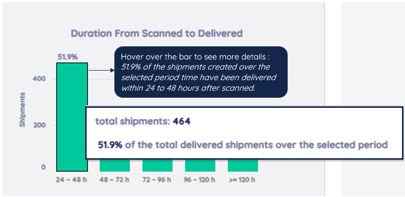
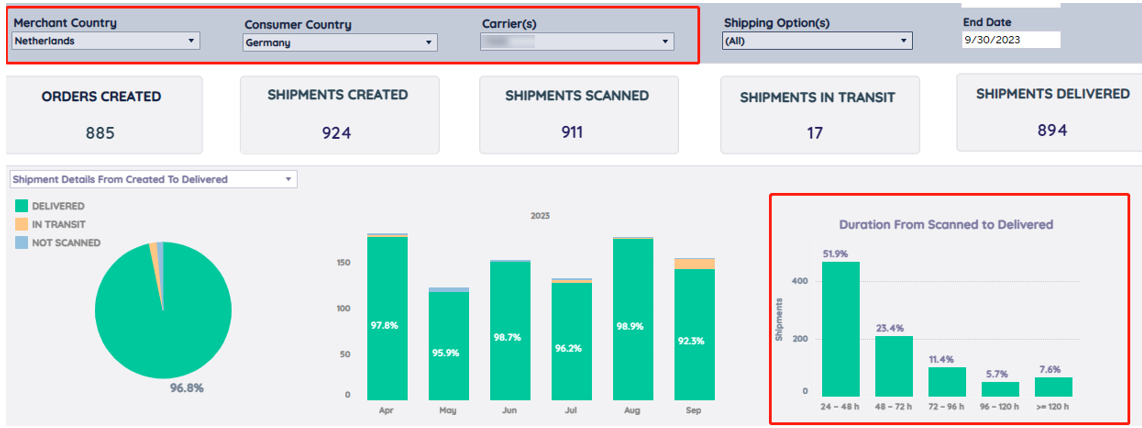
The example above shows us most of the shipments (51.9% of total) shipping from the Netherlands to Germany have been delivered within 24 to 48 hours after being scanned. 7.6% of shipments took more than 120 hours (5 days) to be delivered by the carrier.
Charts – HitRate Of Nominated Date Per Carrier
HitRate of Nominated Date for the past 6 months.
In these charts you find an analysis of the shipments that have a Nominated Date, and whether they actually got delivered on this Nominated Day.
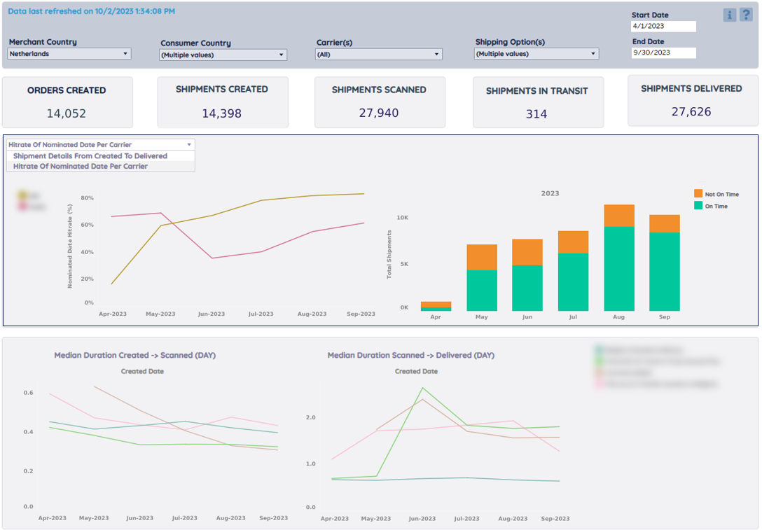
From the drop-down menu, you can access the charts: "Hit rate of nominated date per carrier". Here you can view each carrier's hit rate (success rate) for Nominated Date deliveries over a period of several months, and the overview of the proportions of on-time/not on-time nominated date shipments over the last six months.
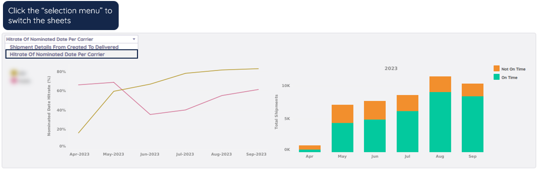
Line Chart - HitRate of Nominated Date Per Carrier Over Time
The line chart shows the HitRate (the percentage of the nominated shipments delivered on the exact date requested compared with the total nominated shipments) of Nominated Date shipments per carrier over time.
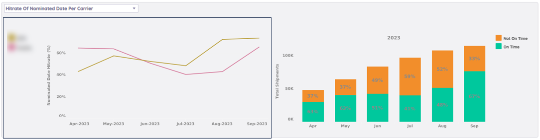
Here you can compare the HitRate in two dimensions:
- Vertical (timeline): look at the HitRates of a certain carrier over time, to easily keep track of performance and see if there are hard drops during certain periods.
- Horizontal (carriers): compare the HitRate of chosen carriers, to see who is doing a better job during the selected period.
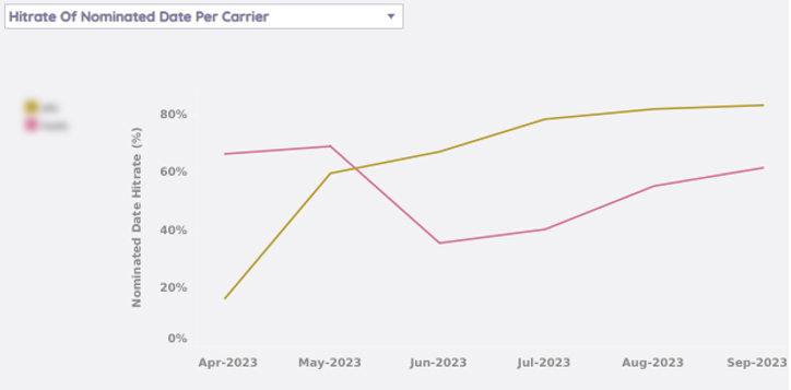
The example above shows that before May 2023, the red carrier was doing better than the yellow carrier, and after that, the hit rate of the yellow carrier went up. It may be worth finding out the reason for the hard drop-down of the red carrier in Jun-2023.
Hover over certain parts of the line to see more details per carrier per month.
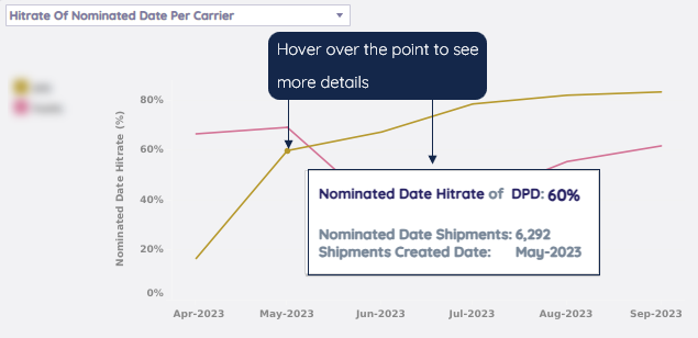
Bar Chart - HitRate of Nominated Date Shipments Over Time
The bar chart shows the number and percentage of Nominated Date shipments delivered on that Nominated Date.
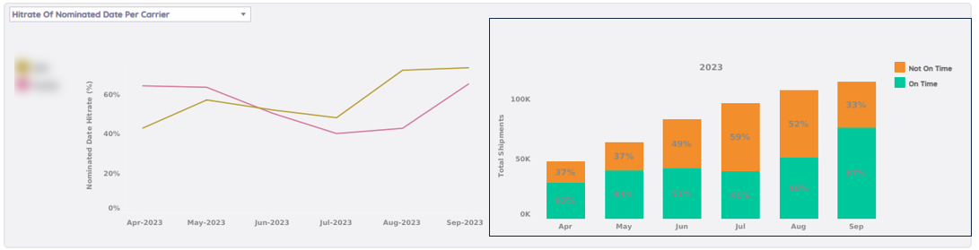
Here you can view the proportions of not/on time of all Nominated Date shipments over time. For example, as shown above, there are 59% of the Nominated Date shipments delivered not on time in July, which is higher than other months. You can do further analysis by downloading the Table-Not On Time-Nominated Date Shipments.
Hover over certain parts of the bar to see more details per category.
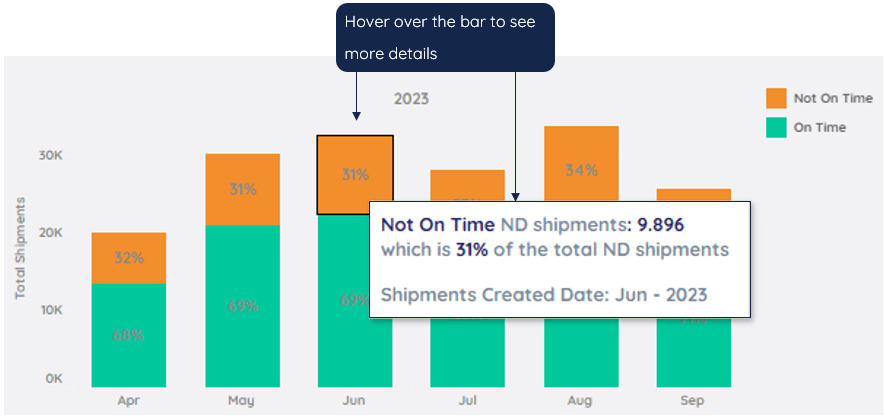
For further analysis/deep dive, download the Table-Not On Time-Nominated Date Shipments.
Below is an example of the downloaded Excel file.
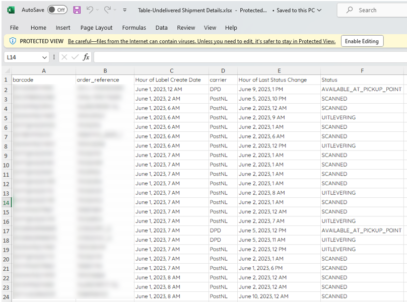
Chart – Median Duration Created → Scanned (DAY)
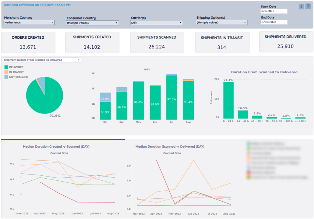
The line chart shows the median durations of the shipments from created to the first scan by a certain shipping option over the selected period of time.
Note
The median is the middle number in a sorted, ascending, or descending, list of numbers and can be more descriptive of that data set than the average.
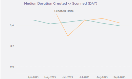
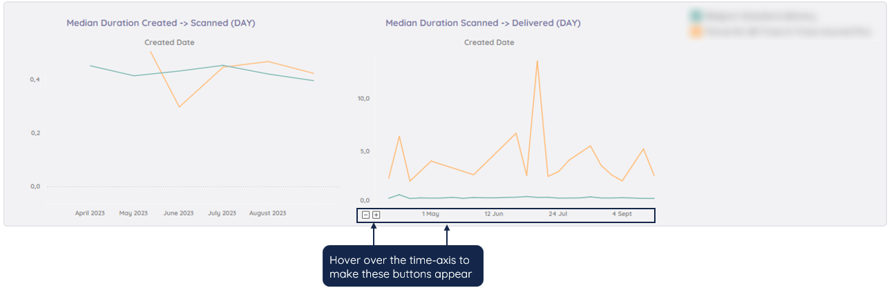
The example above shows that from April through Sep-2023, it typically took less than half a day for both green and orange carriers to scan a package after it was created. However, in terms of this duration (creation to pickup), the green carriers have been more consistent than the orange carriers over the six months.
Hover over the points to see more details per month.
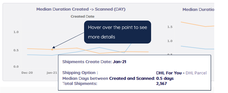
Chart - Median Duration Scanned → Delivered (DAY)
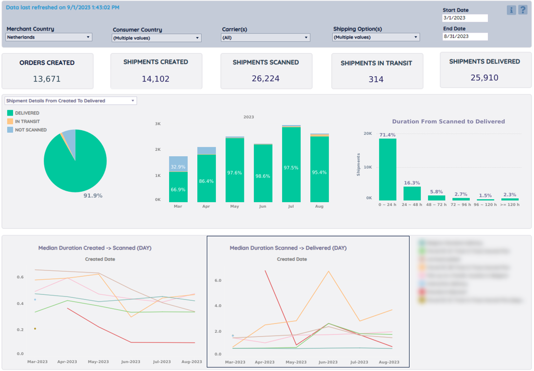
This line chart shows the carriers' median duration per month. Here you can compare the shipping duration over different carriers and also how the duration changed over time for a certain carrier.
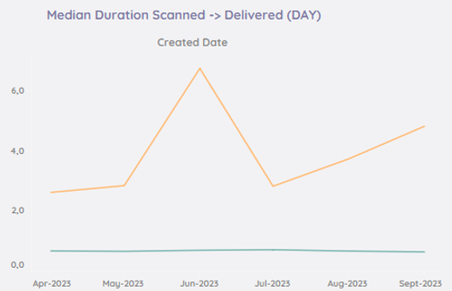
The example above shows that from April through September 2023, the green carrier's shipping duration was much shorter than the orange carrier's. It took less than one day (0.7 day) for the green carrier to deliver parcels, whereas it took the orange carrier at least 3 days, and in June, even about 7 days to get the shipments delivered.
You can use the time axis drill-down/drill-up buttons to break down the carrier duration into weeks or days for a detailed view of specific time periods to compare the carrier's performance as well as their stability.
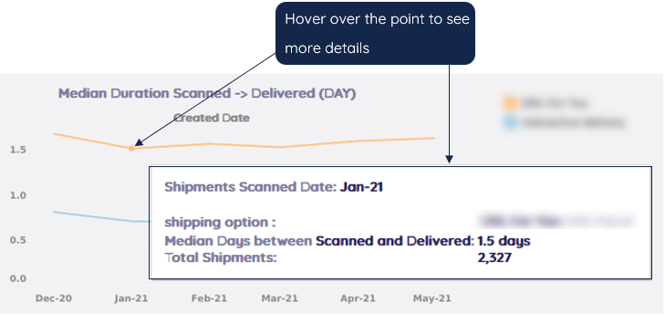
Hover over the points to see more details per carrier per month.
Was this article helpful?
That’s Great!
Thank you for your feedback
Sorry! We couldn't be helpful
Thank you for your feedback
Feedback sent
We appreciate your effort and will try to fix the article